Learning Multi-Block and Reduction Printing
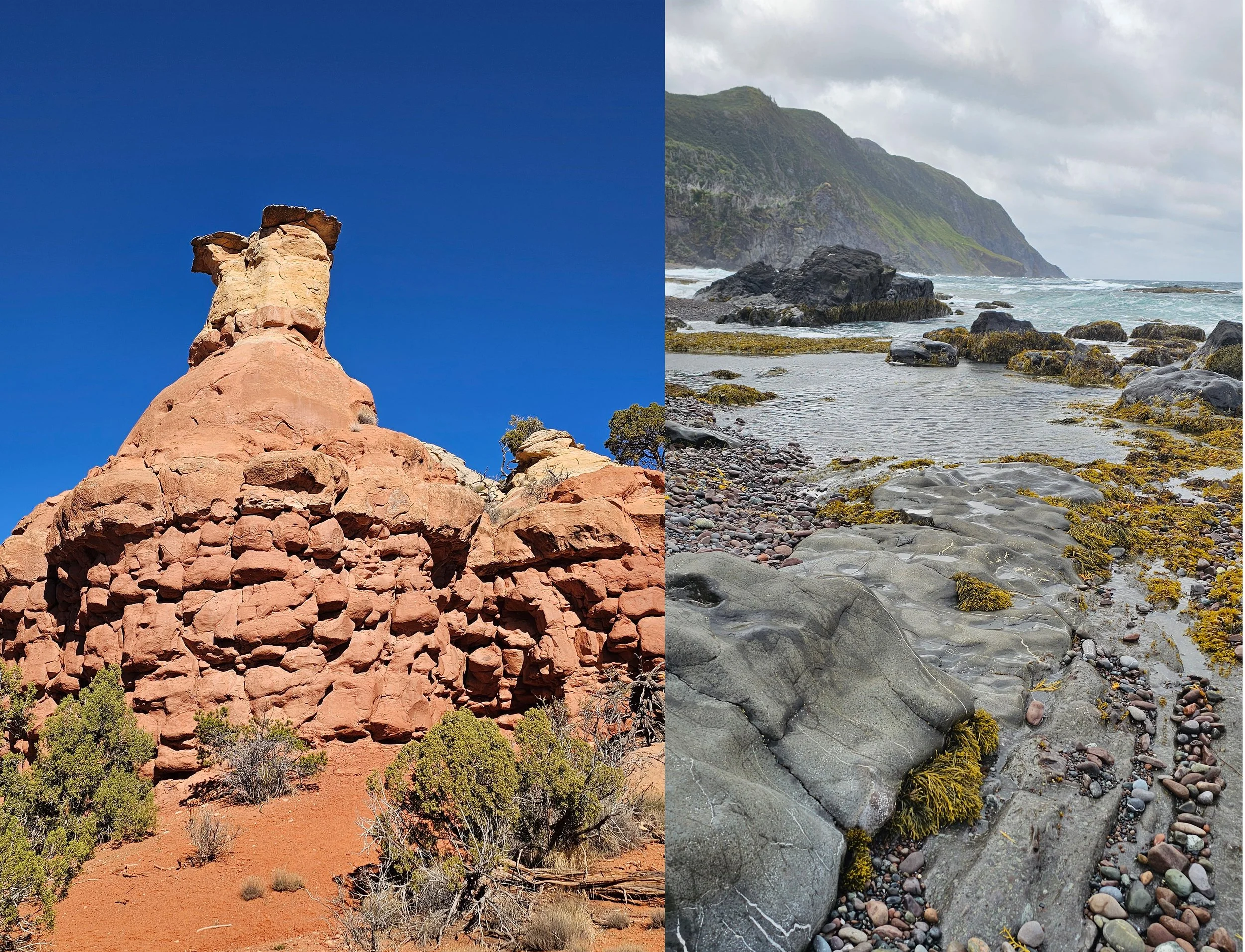
Since coming home from my residency at Canyons of the Ancients National Monument, I’ve been concentrating on learning multi-block printing and reduction printing. I’ve been working with the block I carved during the residency, as well as an older block I carved some time ago of a beautiful beach scene in Newfoundland.
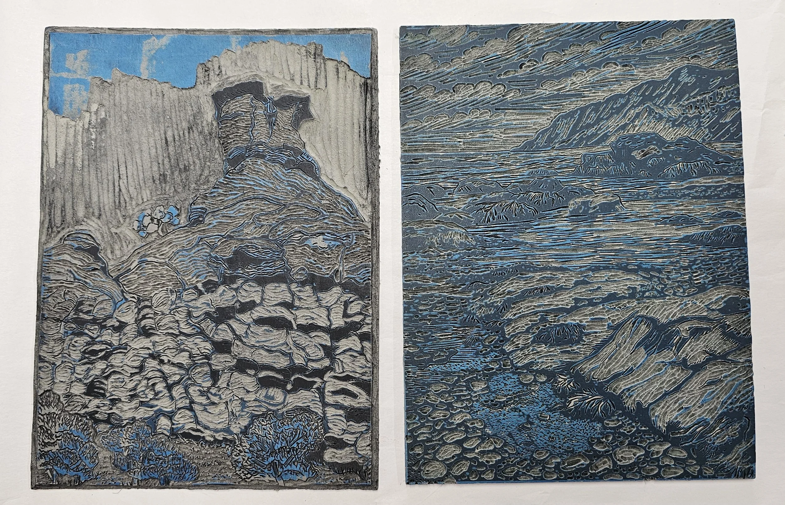
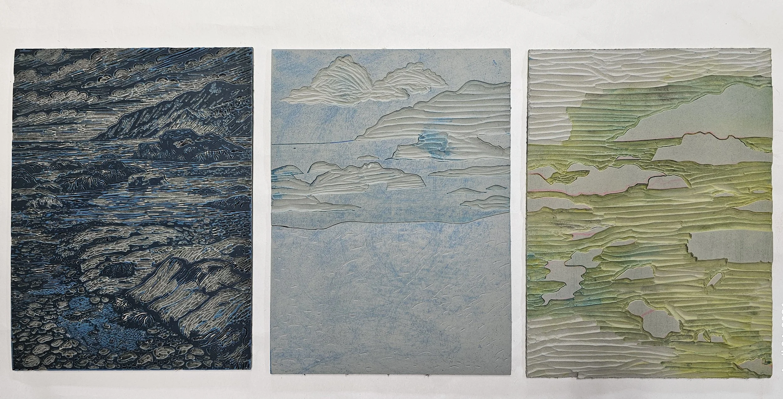
Key blocks for the CANM Rock and Low Tide
Both of these printmaking methods have been stretching my brain in all kinds of ways. There are so many moving parts—getting the registration lined up correctly, mixing ink colors that actually work, and figuring out which layers and colors need to come first. It’s definitely a process that requires patience, experimentation, and a willingness to make mistakes.
And I’ve made plenty of mistakes.
My very first attempts were honestly pretty terrible—but I learned so much from them. I’m finding that I can only really understand what a print needs by doing it, seeing what works, and then adjusting as I go. It’s a very hands-on way of learning, and each print teaches me something for the next one.
One of the biggest lessons has been about ink. At first, I thought rich, thick, saturated layers would make for stronger prints, but I quickly discovered the opposite. Heavy ink takes forever to dry and often looks muddy and heavy on the paper. Learning to use extender to create more transparent layers has made a huge difference. The prints feel lighter, more luminous, and much more layered in a good way.
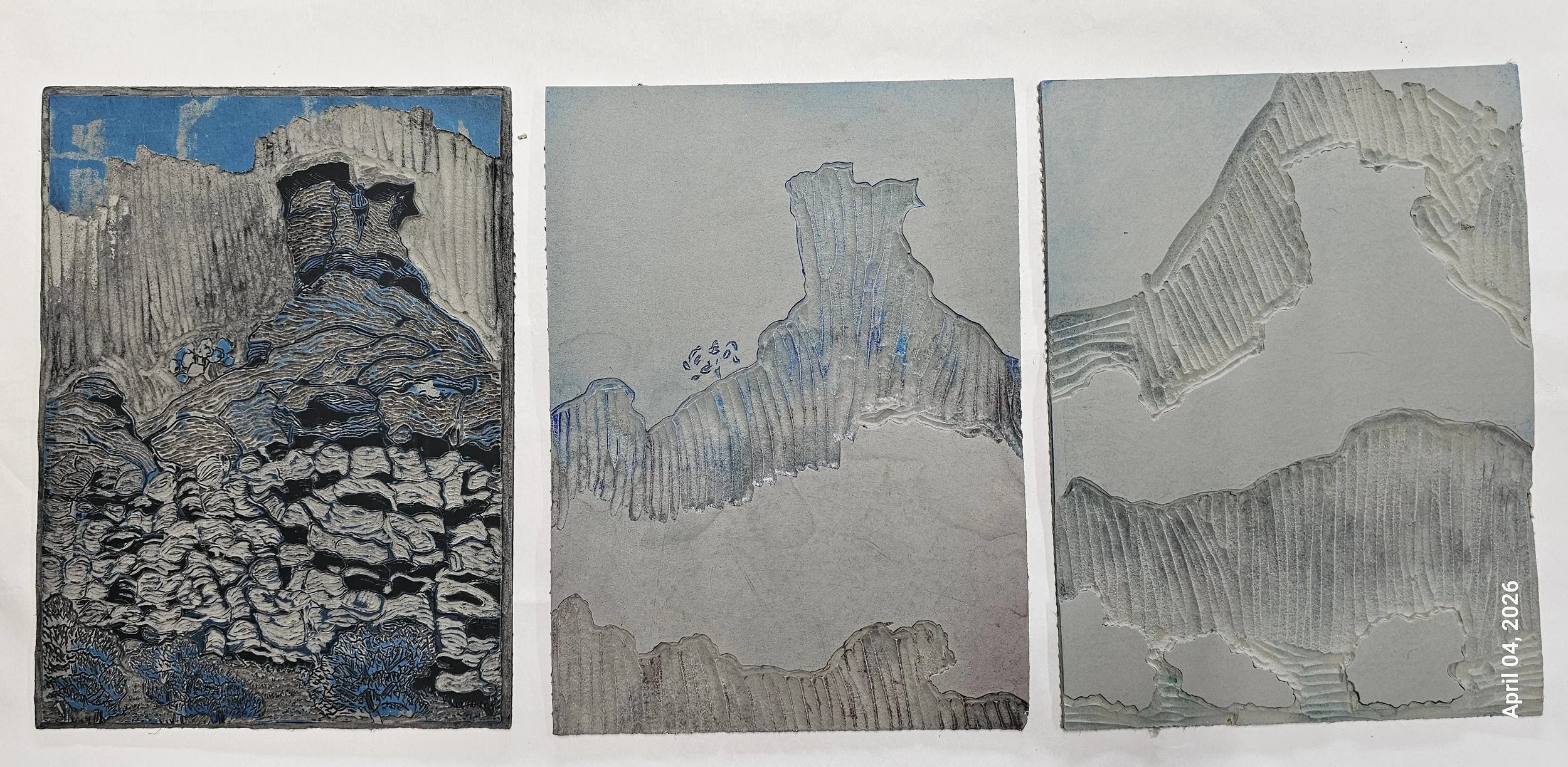
3 Blocks for the CANM Rock
I’ve also learned that in some cases, it works better to carve away an area and print a new color cleanly, rather than trying to layer one color over another and hoping it behaves the way you want. Another possible solution is to use a more opaque ink when a strong color change is needed. These are the kinds of things you really only learn by trial and error.
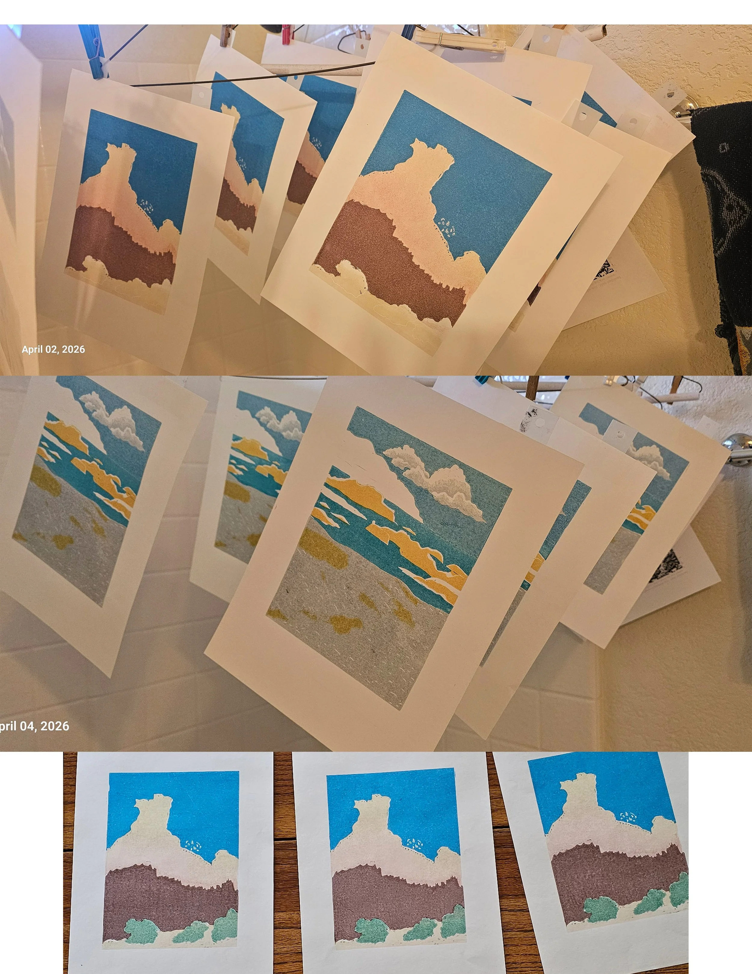
Th rock formation is ready for the final printing of the key block!
Another challenge is simply deciding how many blocks are needed to get the effect I want. For the rock formation print I started at the residency, I ended up refining the original block and carving a couple of additional blocks to handle the different cliff colors and tree areas. That print now uses three plates and four colors.
3 blocks for Low Tide
The Newfoundland beach scene has been even more ambitious. It also uses three plates, but some of the imagery is being developed through reduction printing, and in the end it will have ten colors altogether. Since I print just one color layer each day, it’s a slow process—but one that rewards patience.
One of my biggest do-overs was the sky in the beach scene. In my first attempt, I absolutely hated it. I had even asked ChatGPT for some cloud ideas, and the results were not helpful at all. On top of that, the blue I chose was far too intense for the soft feeling I wanted in a beach landscape. So I scrapped it and redid the entire sky, this time challenging myself to create softer clouds and use much gentler colors in several transparent layers. It’s already a huge improvement.
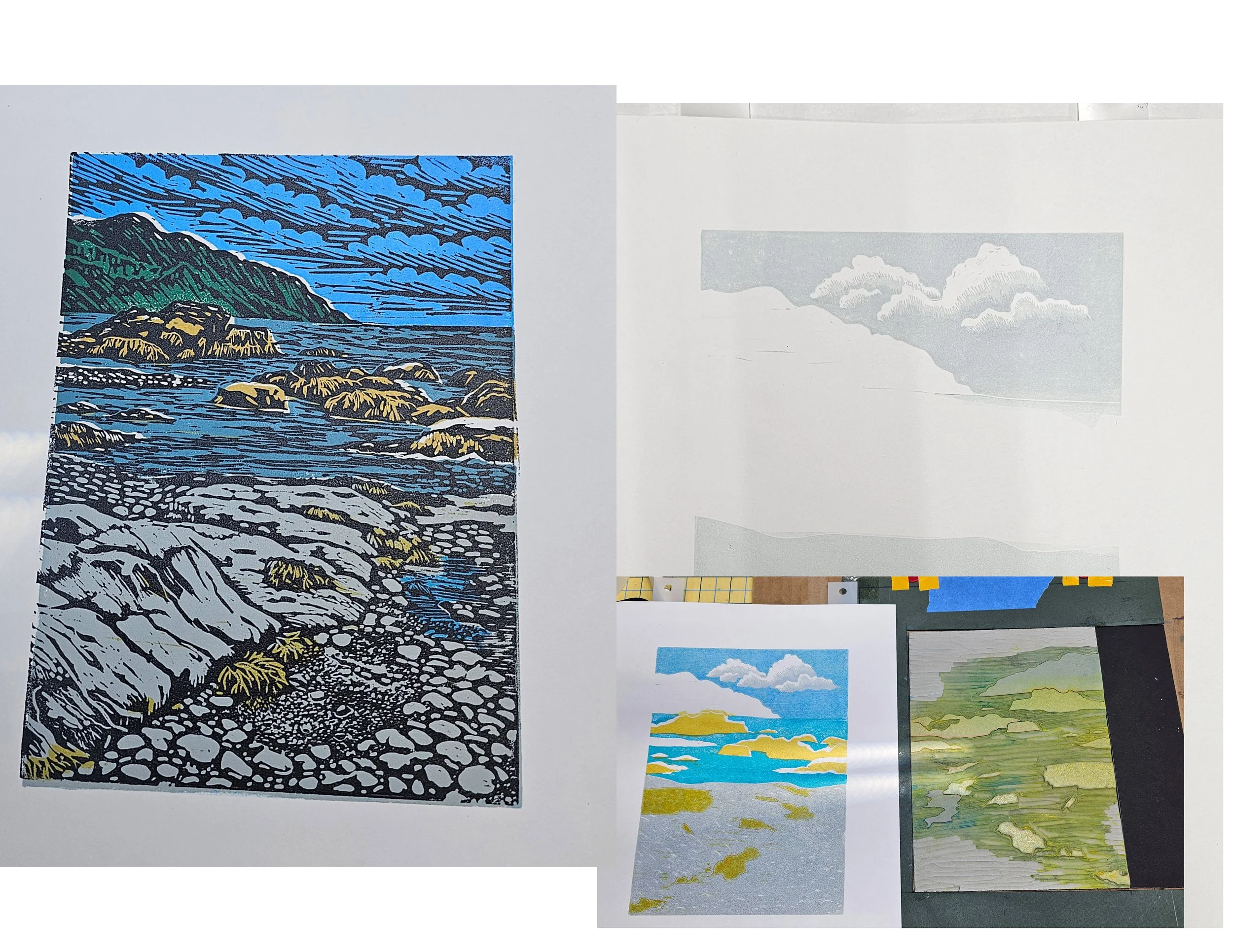
Left, Low Tide the first print with terrible sky/clouds. Right, some of the progression of prints showing the new sky/clouds